Gissell's Cakes
Gissell’s Cakes is a New York City–based home business specializing in beautifully crafted fondant cakes and cupcakes for all occasions. As the lead designer and developer, I was entrusted with building the brand from the ground up—crafting everything from the logo and identity to the full digital presence.
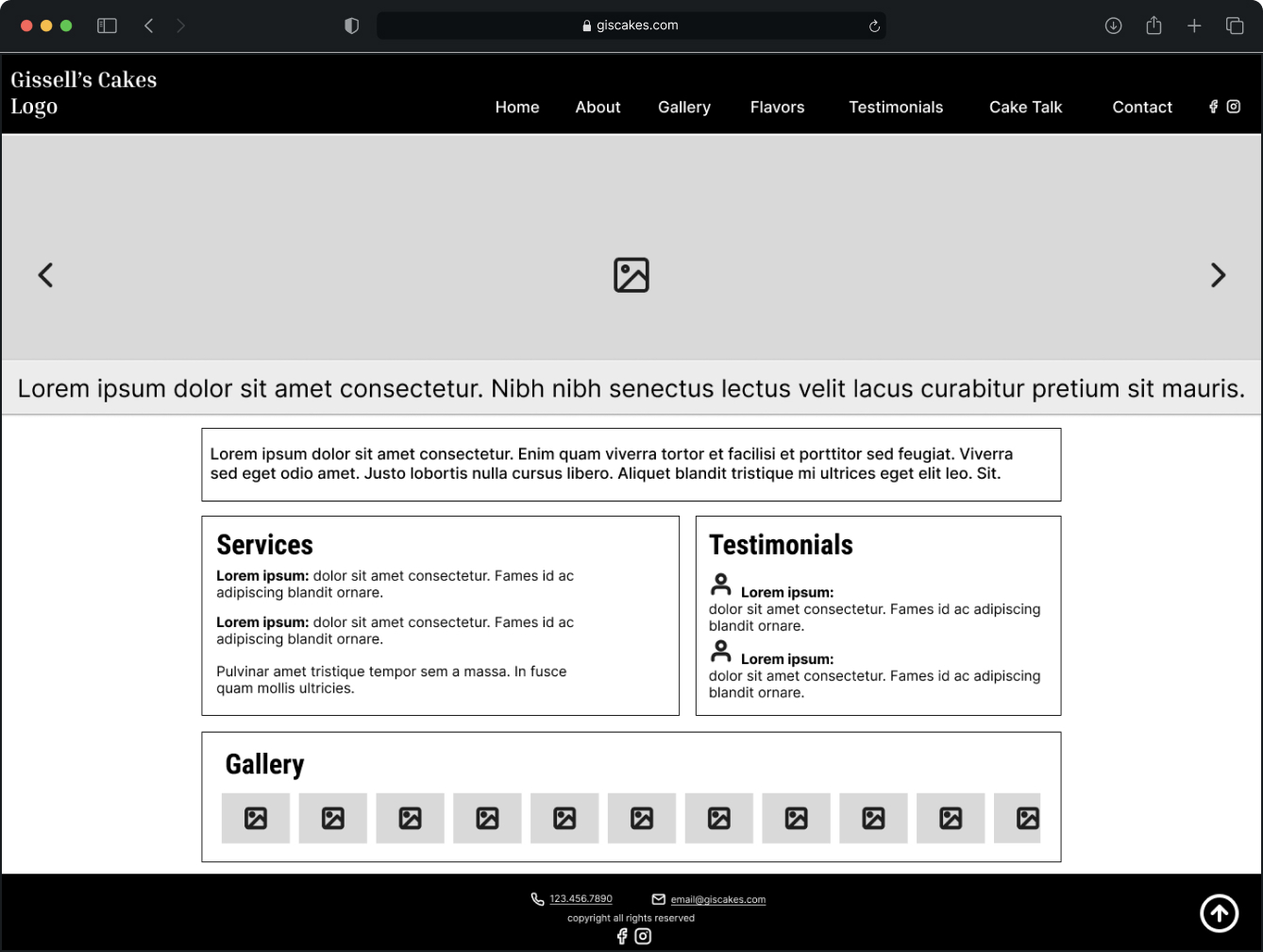
The website was designed and developed with a clear focus on user experience, visual appeal, and search engine performance. Powered by WordPress, the site utilizes a custom-built child theme tailored to the needs of the business. While some elements are static for performance and simplicity, the site also includes dynamic features—most notably, a fully automated gallery.
The gallery is powered by custom-built functions that dynamically load images, generate accessible alt tags, and create modals on the fly—each with a unique title and seamless user interaction. JavaScript libraries were implemented to enhance the homepage slideshow and gallery experience, while HTML, CSS, PHP, and JavaScript provided the structural foundation.
From a visual standpoint, I designed all branding and marketing materials using Adobe Photoshop, Illustrator, and InDesign. This includes the logo, icons, packaging stickers, social media templates, and printed collateral. Each piece was created to align with the personality and aesthetic of the brand: sweet, personal, and polished.
Over the years, the site has gone through several revamps to stay current with design trends and technology, ensuring the brand continues to grow and evolve. In addition, a focused SEO campaign was launched, resulting in high rankings on organic Google searches—bringing in steady traffic and generating qualified leads and customer inquiries.
The live site can be viewed at: giscakes.com
Mobile UX Approach

Every great interface starts with structure. Using Figma, I mapped out low-fidelity wireframes with a mobile-first mindset—prioritizing content hierarchy, user flow, and functionality across all breakpoints. These blueprints kept the team aligned on layout decisions and ensured the design stayed user-focused before any pixels got pretty. Wireframes acted as the skeleton that would later support the full visual story of the site.

Design comes to life in the details. Building on the wireframe foundation, I created high-fidelity mobile mockups that focused on delivering an exceptional small-screen experience. Using Photoshop and Illustrator, I tailored brand elements—color palettes, typography, icons, and imagery—to ensure clarity and consistency at mobile sizes. These mockups transformed structural blueprints into intuitive, engaging mobile screens that aligned the team on how the brand should truly feel in users’ hands before moving to development.
Desktop UX Approach
Designing for the full canvas. After establishing the mobile-first foundation, I expanded the wireframes to address the needs of desktop users. Using Figma, I refined layouts to take advantage of larger screens, emphasizing clear content hierarchy, intuitive navigation, and responsive adaptations. These desktop wireframes aligned the team on layout decisions for wider viewports and ensured the user experience remained consistent and intentional across all devices.

Scaling the experience for the big screen. Building on mobile designs, I developed high-fidelity desktop mockups to optimize layout, readability, and brand expression across larger viewports. Using Photoshop and Illustrator, I adapted color palettes, typography, imagery, and interactive elements to take advantage of the expanded space while maintaining consistency with the mobile experience. These mockups ensured the design translated seamlessly to desktop, giving the team a clear, unified vision before development.